
Startups spend a great deal of time and money getting people to visit their marketing site (aka, their website). A startup’s marketing site typically exists to establish brand awareness, promote a sense of reliability, generate leads, and sell products or services.
What is unfortunate, however, is how many times a poorly designed site can hinder these processes, not help them.
There are many aspects of a site’s design that can be optimized to increase conversions, and therefore return on investment for advertising. Now, when I talk about design here, I’m not so much talking about font choice, overall color scheme, or whether you use rounded corners or not. While the overall design can give your website a certain “feel”, and that is certainly something you want to work in your favor, what I am talking about are the strategic decisions behind the website.
When it comes to the strategy for startup website design, I like to recall the Hippocratic Oath that doctors often hang in their offices:
“First, do no harm”
To illustrate this, I’ll share a real experience I just had visiting a particular startup’s website. I know that Apple just unveiled their Apple Watch, which is priced at $350. When the design team (led by Jony Ive) talked about the watch at a recent keynote, they were very excited. Jony, who has a successful track record designing Apple products for the past several years, has been vocal with his enthusiasm about the project. Now, with that said, a $350 price tag is a bit steep, so when I heard that one of the pioneers in the smartwatch industry, Pebble, has lowered their watches to starting at $99, I immediately went out to their site. I wanted to find out more about the watches, what they looked like, and what they could do.
Not only did I not immediately see what I was coming to find, but I was completely turned off by the company as a whole after seeing what they chose to focus on their homepage:
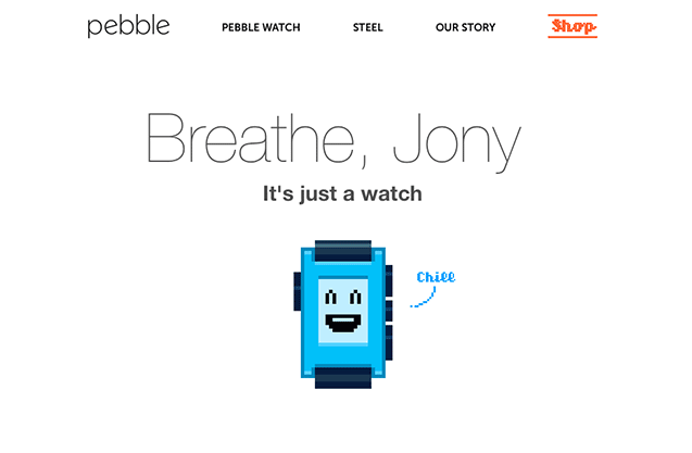
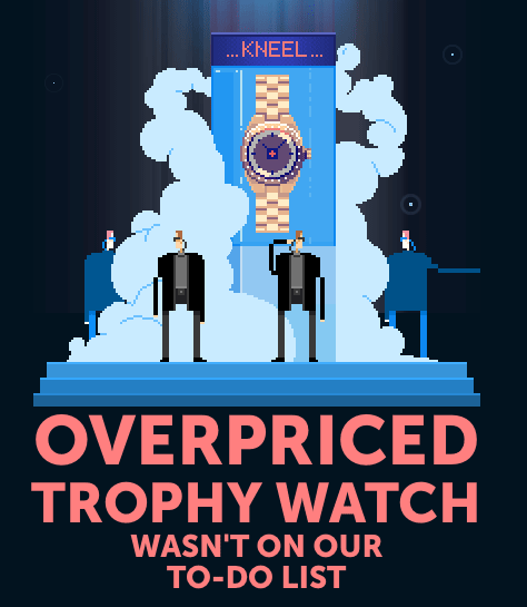
“Breathe, Jony. It’s just a watch.” What? What on earth does this have to do with your Pebble smartwatches? I get it, the team at Pebble is probably worried about their first-to-market advantage now that Apple is entering the races, but to sling mud at them for their designer’s enthusiasm? That’s just unprofessional and is a big turn-off. The rest of the website goes on to talk a little bit about the Pebble, but with no actual photos of the watch, or list of features. There are, however, a few more jabs taken at Apple-like “Overpriced trophy watch wasn’t on our to-do list”.
What is unfortunate about this story is that I, a consumer, was interested in their product. They lowered prices, which generated some buzz that lured me to their website to find out more information. With the right design strategy and product positioning, they could have had me whipping out my credit card that day to make a purchase. Unfortunately, their marketing site turned me away as a potential customer and made themselves a poor case study to be highlighted here.
Don’t make this mistake. First, not harm.
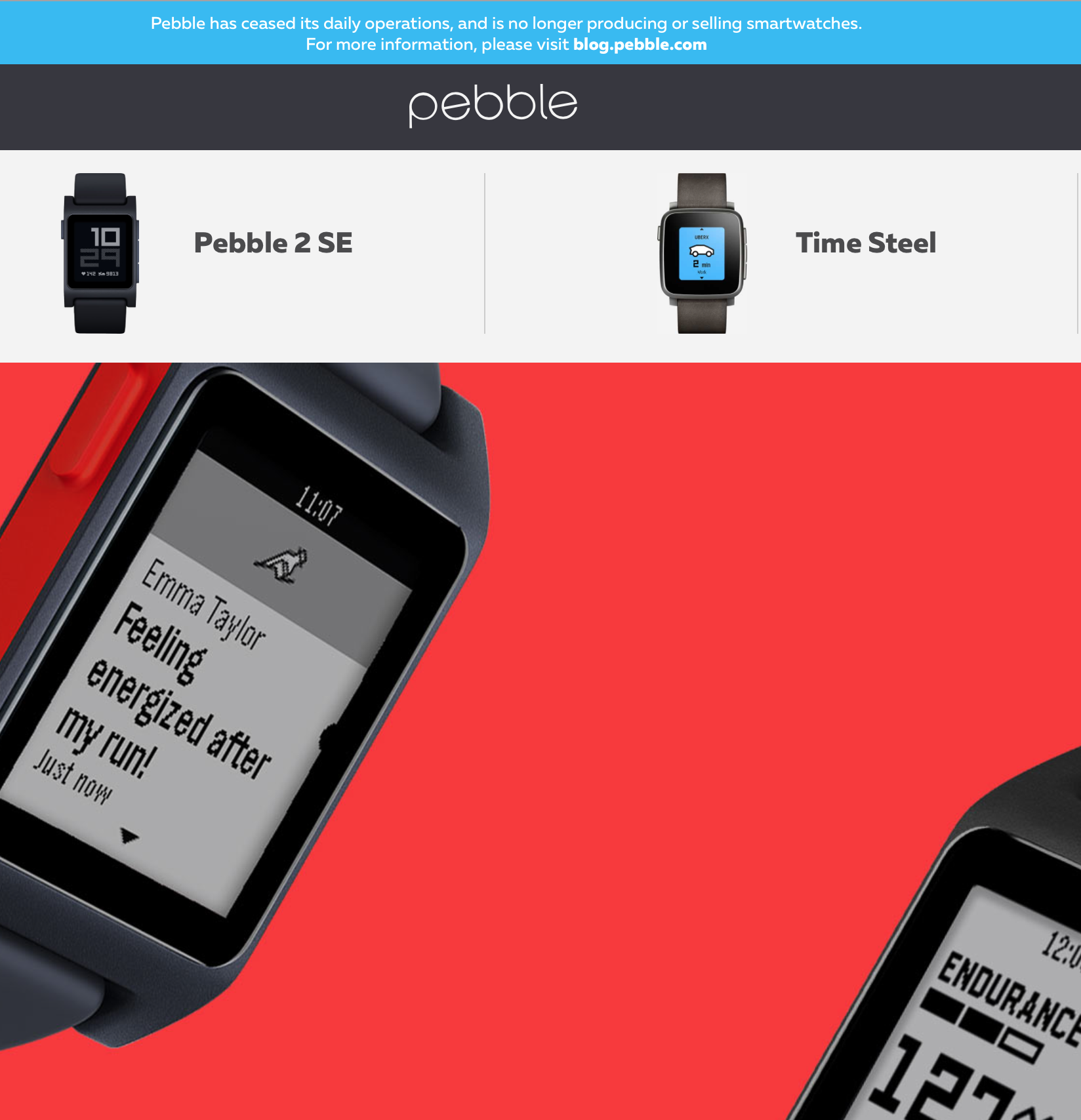
Update: Pebble has ceased operations and is no longer selling smartwatches, but at least they show their actual product now on the website.
An Ever Evolving Strategy
So if your marketing site isn’t doing any harm, then it must be doing some good, right? The design strategy of a website should be always evolving to drive ever more engagement. Engagement might include:
- Longer time on the page
- More pageviews per visit
- Signing up for more information
- Downloading an eBook or Whitepaper
- Making a purchase
- Sharing a url on social networks
- Following your brand on social networks
As I highlighted in a previous post about optimizing your copywriting for conversion, every little change can add a few percentage points to your various engagement goals, and with the right combination of optimizations, you might start seeing a 300% or more increase in engagement on your site.
Optimized Use of Imagery
Oversized Images
A recent trend in website design is to feature a large, oversized image behind the text at the top of a page. While you can argue for or against a design preference for this style, what we’d like to know is “Does it make a difference in conversions?”
CrazyEgg published a comparison study highlighting a few companies that re-designed their pages to incorporate this trend. In every case, the oversized image increased conversions. Now, as with any optimization, the only results that truly matter are how effective the switch is on your site, with your brand, and your unique audience. However, when there is a pattern that emerges, it makes for a great starting point for an optimization experiment.
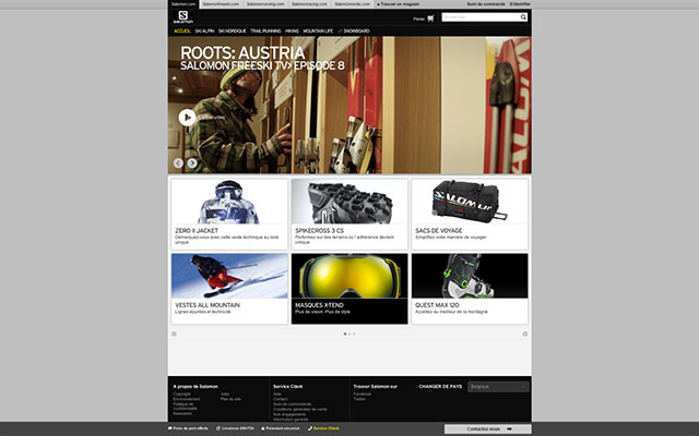
Saloman, a French-based snowboarding site is one company that applied the oversized image design. As you can see, their initial design was pretty nice, to begin with:
However, when they switched to the oversized image in their header, their sales by French shoppers increased by 39.8%:
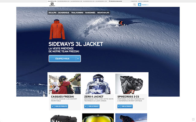
It is much easier and more profitable to make a design tweak to increase sales by nearly 40% versus increasing your advertising budget by 40% or reducing your expenses by as much.
Every Image Needs a Purpose
Of course, you can’t just throw any image on the website, even if it is oversized, and expect increased conversions. Imagery should have a purpose. Does it reinforce your brand? Does it draw people in? Or does it just fill space?
Take the signup page for Webex for example:
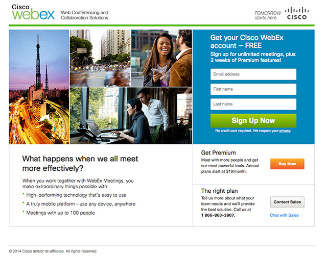
They use imagery, but I’m not sure why that imagery is there. Does it show me how useful their products are? One of the photos is a time-lapse of traffic, another is of people crossing the street. What does this have to do with virtual meeting software? Perhaps a better use of this space is to show an image of customers receiving value from the software, or using the software. How about a video placeholder image for a customer testimonial?
Using Imagery to Direct Attention
Whenever we see an image of someone looking at us, we are drawn in to focus on their eyes. It’s human nature. However, what is strange is that when a person in an image is looking in a certain direction, our eyes are drawn to go towards what they are looking at.
A study by UsableWorld revealed how many more people read the headline and supporting copy when a baby was looking at the words vs. when that baby is looking directly at the camera:
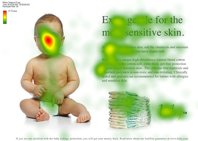
Note how the majority of visitors’ eyes focus on the baby’s face (the red zone), while less attention is paid to the headline and supporting text.
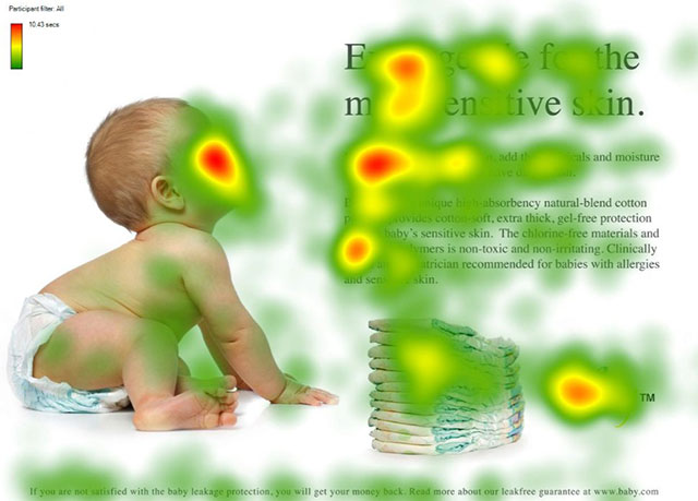
In contrast, when the baby was looking at the text, there appears to be much more attention paid to the headline, supporting copy, and company logo.
A similar study was shared by Think Eye Tracking where they highlighted 84% more views of the product when the model was looking at the Shampoo bottle vs. the camera:
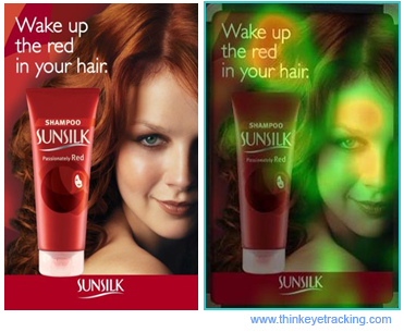
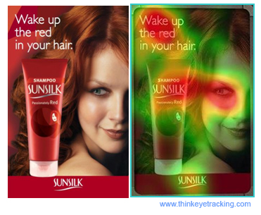
Note also how much more focus the ad as a whole received in the second photo. Not only did more people see the product (which will then be more likely to jump out at them when seeing it on the shelf), but more people read the text as well, raising the overall effectiveness of the ad.
Visual guidance is a powerful tool in engaging people on your site, as well as suggesting certain courses of action during the visit.
Signup Forms
Length
Whether it is an email signup form or a website registration form, odds are your startup has a form of some sort on your marketing site. Getting this form in front of your visitors isn’t difficult, but convincing them to give up some personal information and submit the form is something that can certainly be optimized and improved.
To start with, ask for as little information as possible. Of course, it would be nice to have their demographic information, how they heard about you, and what their annual budget is for your product or service category. However, if that information is not necessary, you’ll have better conversions.
In one study, a form that initially held 11 fields was reduced to 4 fields. The result was an increase in form submissions by 160%, while the quality of the form submissions remained about the same since many people tend to lie on long forms.
Two-Step Opt-in Forms
When asking people to download a gift, or sign up for your mailing list, a typical form might look like this:
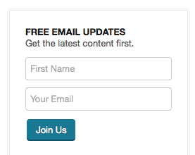
This example presents the fields and the submit button right to the user while they are viewing the page. While this traditional approach is generally effective, many folks are seeing increased signups by using what is known as the “Two-step Opt-in”. This isn’t sending out an email confirmation before adding them to the list, although that practice sometimes goes by the same name. What I’m talking about here is using a link to bring up a form via a modal, essentially using two steps to get them to submit the form. Here is an example from Pat Flynn’s Smart Passive Income Blog:
Step 1 (inline on the page)
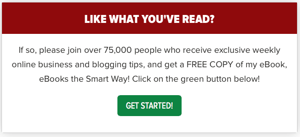
Step 2 (pops up via modal after clicking “Get Started!”
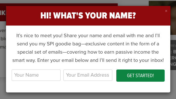
Incorporating this strategy in his blog increased his opt-ins by 25%. This seems to go against common logic, why would more steps improve the conversion rate?
The theory is this: that when you present a form with fields, visitors tend to see your site as wanting something from you, vs. when they simply see a link that says “Get your free X”, they see your site as giving something to them. It’s a subtle difference, but their attention is more likely to glance over your site wanting something vs. your site giving something.
Another aspect of this technique leverages a well-known sales tactic. Get people saying “Yes” to a series of questions, and they are more likely to say yes to your offering:
- Do you have this pain point? (Yes)
- Would you like that pain point to go away? (Yes)
- If I had the solution would that be valuable to you? (Yes)
- Would you like to buy? (Yes)
In effect, by asking them if they want to download something for free, they’ll be more likely to say “Yes” if you don’t ask them for their email to click the button. However, after they’ve clicked the button, then you ask them for their email address to send it to them. Because they just said “Yes” to download it by clicking the button, they are far more likely to fill in their email and send the form.
Because this move is a little controversial (why make someone click twice to join your list?), it is a strategy that you want to test out and see if there is a difference in your own conversions rates.
Pricing Pages
If someone has made it to your pricing page, odds are they came there from another page on your site. That’s good! That means we have someone interested in learning more, we have their attention, let’s optimize converting that attention into a purchase.
There are several rules to follow for a successful pricing page design:
- Keep it simple. If people have a hard time wrapping their minds around your pricing structure, they’ll be less likely to do the mental math and just move on.
- Suggest a plan. Suggest a plan by making one plan larger, or highlighting it with a different color, etc. This can be the most popular plan, the plan that is free for getting started, or the most expensive plan, which when highlighted will make all other plans seem more affordable. Test highlighting different plans to see what the overall effect is on signups and average plan price.
- Make clear distinctions between plans. People should be able to see pretty quickly what the differences are between plans. This is why a table design is so popular when it comes to choosing plans.
- Address Barriers to Purchasing. If you have a money-back guarantee, this is the place to tout that. You can also provide testimonials, or recognizable company logos to establish trust. See the example from Grasshopper:
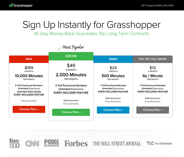
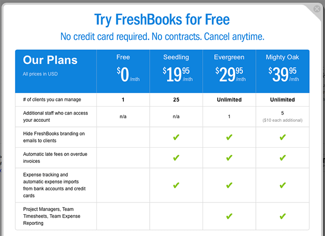
Another interesting tactic to note in the above example is how Grasshopper displays their pricing plans from highest to lowest. The theory here is that when people see the highest price first, the rest of the plans appear more affordable. However, this is not a universal rule, as many other companies who are known to A/B test their conversion designs will place their pricing lowest to highest, like Freshbooks:
As with all other areas of website optimization, the pricing page should be put through its fair share of A/B tests to find the design that converts the most users to the highest profit margins.
Calls to Action
Quantity
Each page on your website should have a call to action. The question is, how many, and how prominent should it be? For pricing pages, you will likely have a call to action for each plan, whereas a landing page for an advertising campaign might have a single call to action, “Find out more.”
For the homepage, some companies prefer to have a handful of calls to action, treating the homepage as a launchpad to various areas of their site. For many startups, however, a single call to action is best. The fewer calls to action you present to your audience the greater their likelihood of following through with a given action.
A call to action doesn’t have to be a button, although this is what we most think of when naming a call to action. A call to action might be a text link, an interactive widget, a form, or even your navigation on the site. This is why many landing pages lack site-wide navigation, choosing instead to focus on a single action a visitor should take.
Visual Prominance
The most effective calls to action are visually prominent ones. The whole point of a call to action is to prevent the visitor from asking “What should I do next”, so the more obvious your call to action is, the better it will perform.
For example, Dayboard does a good job in their design making their call to action button stand out:
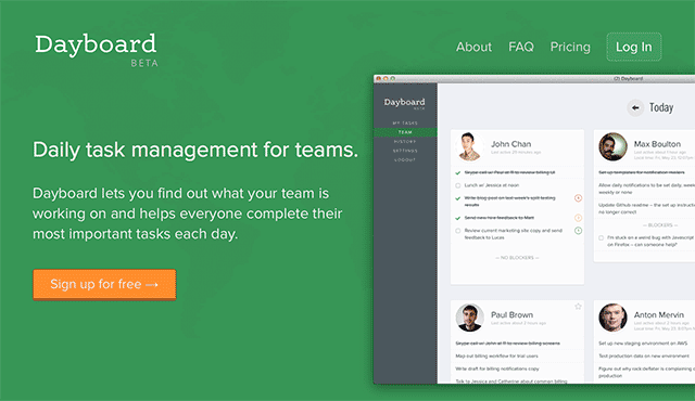
As a way of testing the obviousness of calls to action, I like to desaturate the image to see if it remains prominent:
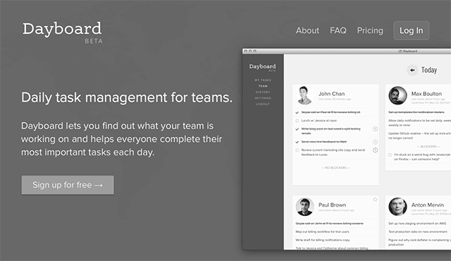
I also like to give a blur treatment to a screenshot and see if the call to action still stands out:
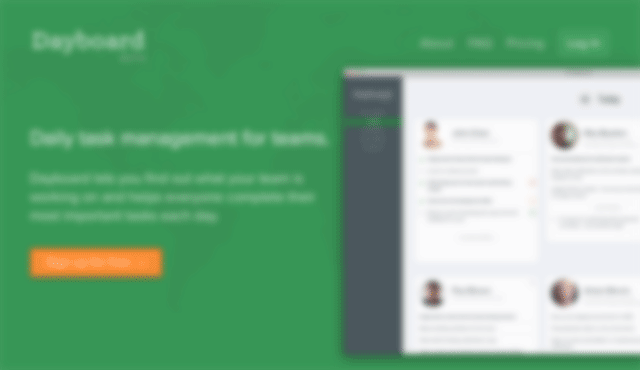
As you can see, Dayboard passes both tests with their chosen call to action color and placement of other elements on the page.
Copy
The copy of a call to action button can affect your conversion rates significantly, so this is another important area for optimization. As with all optimization tests, the best data can be found when you can see as far down the conversion process as possible, and how that affects your overall profits.
For example, Unbounce changed its call to action button copy from “Build a High-Converting Landing Page Now” to “See Plans and Pricing”, and increased its sales by 80%! However, if you visit their website today, you’ll see that they’re still using the first version of the text:
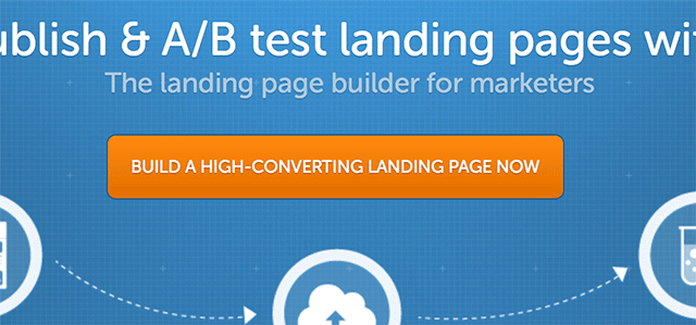
Why would they do this? Further analysis revealed that while they had more sales, they lowered their “ideal” plan purchases (the $99/mo plan) by 22%. They had more purchases, but their overall profits went down.
It’s hard to say what exactly will work the best for your call to action text, a lot depends on your ideal customer, what their most pressing needs are, and what piques their interest making them want to click through.
Social Proof
Whether it is your homepage, about page, contact page, or landing page, your website design strategy will benefit from displaying some form of “Social Proof” that garners the trust of your visitors. Subconsciously we ask ourselves “Am I the only sucker that is signing up for this?”.
Now, if you are a startup, you might not have all of the press mentions from CNN, Forbes, and The Wall Street Journal. That’s okay, there are many other things that you can build into your design that will display social proof. The key is to find the proof method that paints your company in the best light:
- Social Share Stats
- Newsletter Subscriber Stats
- Embedded Tweets
- Testimonials
- Reviews
- Media Mentions
- Podcast Mentions or Interviews
The easiest of these to acquire should be some form of testimonial. If your product hasn’t launched yet, show some mockups to someone in your network and get their impression of them. Of course, a recognizable name next to a testimonial carries more weight, but if the only social proof that you can find comes from other people in your co-working space, be sure to show a small photo of the person giving the testimonial, and perhaps a byline of what that person does for a living. Something like the following can be very effective:
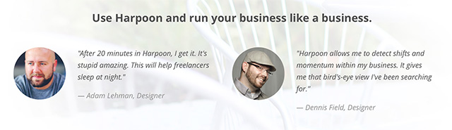
These testimonials were gathered from a couple of designers that we knew locally, who we gave early access to Harpoon and asked for their honest opinions.
Landing Pages
Whenever you link to your website from an outside source, the default location is to send people to your homepage. However, you can gain a better conversion rate by providing a dedicated “Landing Page” for the specific audience that clicks on that link.
For example, when you take out an advertisement, the landing page for that advertisement should reflect the same messaging and tone as the ad itself. If the ad is graphical, the graphics on your landing page should match up to show continuity.
Landing pages also typically lack navigation, and the only clickable item on the page is a call to action to learn more, sign up for a webinar, etc.
Typical use cases for a landing page:
- Adwords destination
- Social ads destination
- Display ads destination
- Ebook landing page
- Webinar landing page
- Blog subscription form
- Guest posts byline link destination
- Speaking events link (either in your speaker bio or given at the end of your talk)
- Industry-specific pages (if your product serves more than one industry)
- QR Code destinations
- Business card urls
- Contests
There are nearly endless reasons to make a landing page. If you use a content management system like WordPress, these can be created within your site. If you aren’t inclined technically or with a design eye, you can use an external tool to build these pages like Leadpages or Unbounce. These tools also allow you to tie their pages into your URL structure, so they appear as a part of your website.
However you decide to implement them, landing pages are a better strategic design than sending all of that hard-earned traffic to your homepage, where a one-size-fits-all message greets them, often with fewer conversions.
Key Takeaways
- Marketing site design, when approached from a strategic standpoint, can make a huge difference in your company’s profitability.
- First, do no harm with your marketing site
- Set up analytics to track how changes in design affect conversions, and ultimately, profit.
- Consider oversized images for your homepage and landing pages.
- Consider where your images are directing visitor’s eyes.
- Keep signup forms as short as possible.
- Consider a two-step opt-in form strategy.
- Keep your pricing page simple, providing clear distinctions between plans.
- Test your pricing pages from biggest plan to smallest, and vice-versa.
- Address barriers to purchasing with testimonials and guarantees.
- Try blurring your pages with a call to action to see if it stands out.
- Leverage social proof in your design strategy to secure trust.
- Use landing pages to increase conversions from outside sources.